I was always wondering how a timeline layout for a portfolio website could look like. I tried two timeline layouts:
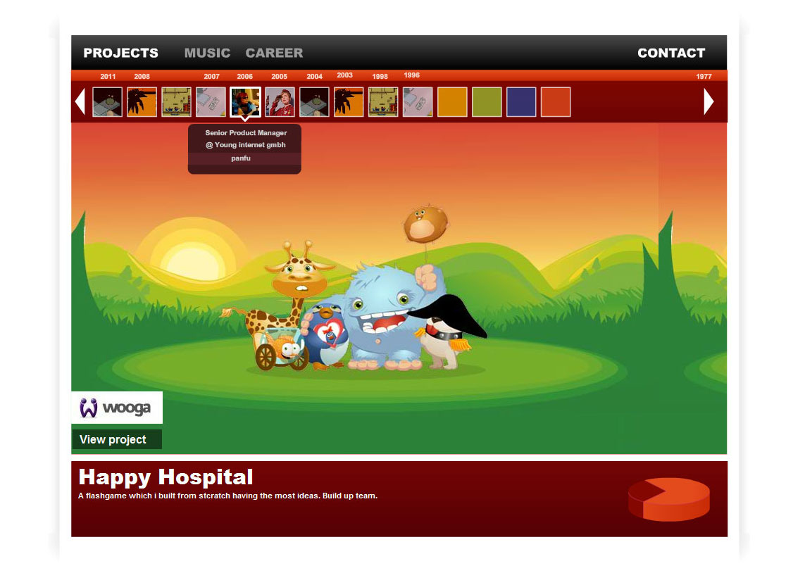
1) The thumbnail timeline
- Projects or entries are aligned next to each other according to the year when it was released.
- The timeline can be browsed to the left and right.
- Hovering the thumbnail will give additional information in a mouse over
- Clicking the thumbnail will change the image and information of the main body

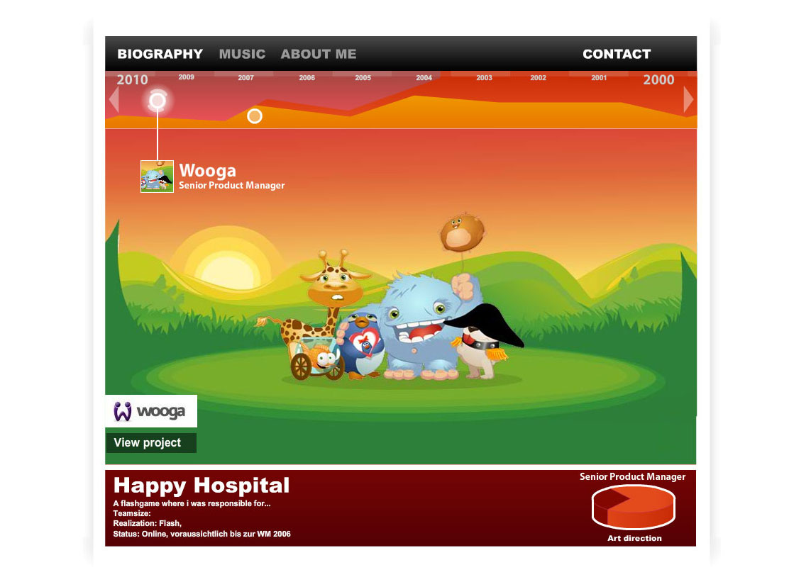
2) The “topic” timeline
- Projects or entries are aligned in a information graphic where the user can define how much she worked on one topic
- Example:
- red represents a topic like graphic design
- orange a topic like audio production
- The user can display how much time effort she put on one topic in which year
- This would also work for carrier steps (company 1 = red, company 2 = blue, University = yellow and so on)
- Finished projects would be represented by dots
- Hovering the dots will give additional information in a mouse over
- Clicking the dots will change the image and information of the main body
- The timeline can be browsed to the left and right.

So what?
I built prototypes for both in flash and they work pretty fine. I ran obviously into usability issues with the second approach when testing them.
The focus is simply too much on “it looks nice” rather have an interface which is well understood.
I also realized that flash is not a good technology for a portfolio or website anymore and stopped working on it. Check out a rough, almost not working version here.